serpentTools.plot.cartMeshPlot
-
serpentTools.plot.cartMeshPlot(data, xticks=None, yticks=None, ax=None, cmap=None, logColor=False, normalizer=None, cbarLabel=None, thresh=None, **kwargs)¶ Create a cartesian mesh plot of the data
- Parameters
data (numpy.array) – 2D array of data to be plotted
xticks (iterable or None) –
yticks (iterable or None) – Values corresponding to lower x/y boundary of meshes. If not given, treat this as a matrix plot like
matplotlib.pyplot.imshow(). If given, they should contain one more item than number of elements in their dimension to give dimensions for all meshes.ax (
matplotlib.axes.Axes, optional) – Ax on which to plot the data. If not provided, create a new plotcmap (str, optional) – Valid Matplotlib colormap to apply to the plot.
logColor (bool) – If true, apply a logarithmic coloring
normalizer (callable or
matplotlib.colors.Normalize) – Custom normalizer for this plot. If an instance ofmatplotlib.colors.Normalize,normalizer – Custom normalizer for this plot. If an instance of
matplotlib.colors.Normalize, use directly. Otherwise, assume a callable object and call asnorm = normalizer(data, xticks, yticks){thresh} –
kwargs (dict, optional) – Addition keyword arguments to pass to
matplotlib.pyplot.pcolormesh()ormatplotlib.pyplot.imshow()ifxticksandyticksareNone
- Returns
Ax on which the data was plotted.
- Return type
- Raises
ValueError – If
logColorand data contains negative quantitiesTypeError – If only one of
xticksoryticksisNone.
Examples
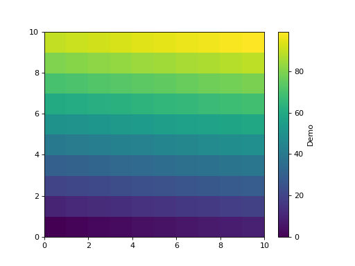
>>> from serpentTools.plot import cartMeshPlot
>>> from numpy import arange
>>> data = arange(100).reshape(10, 10)
>>> x = y = arange(11)
>>> cartMeshPlot(data, x, y, cbarLabel='Demo')
(Source code, png, hires.png, pdf)

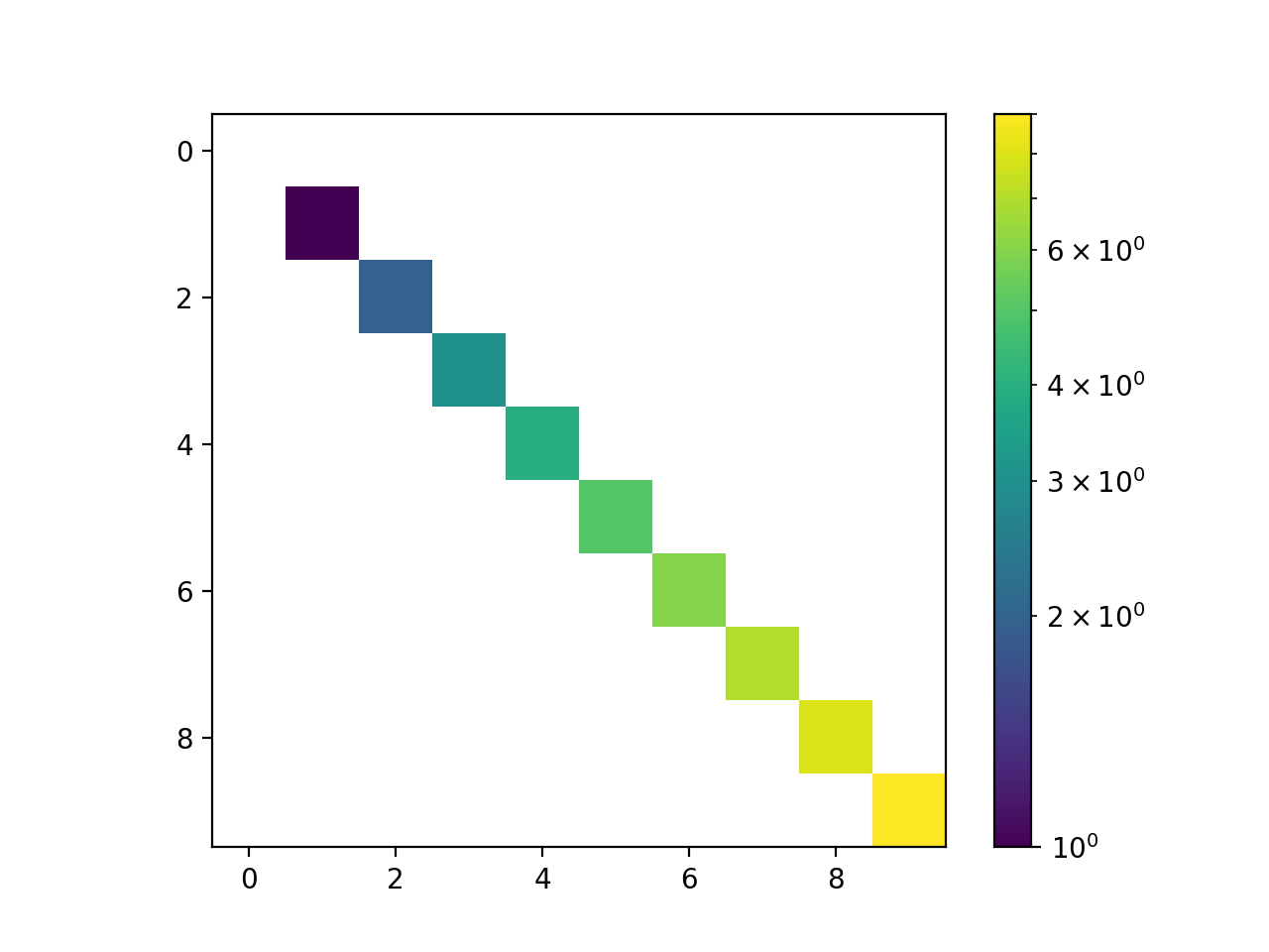
>>> from serpentTools.plot import cartMeshPlot
>>> from numpy import  eye
>>> data = eye(10)
>>> for indx in range(10):
...     data[indx] *= indx
>>> cartMeshPlot(data, logColor=True)
(Source code, png, hires.png, pdf)
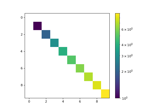
All values less than or equal to zero are excluded from the color normalization. The
logColorargument works well for plotting sparse matrices, as the zero-valued indices can be identified without obscuring the trends presented in the non-zero data.Alternatively, one can use the
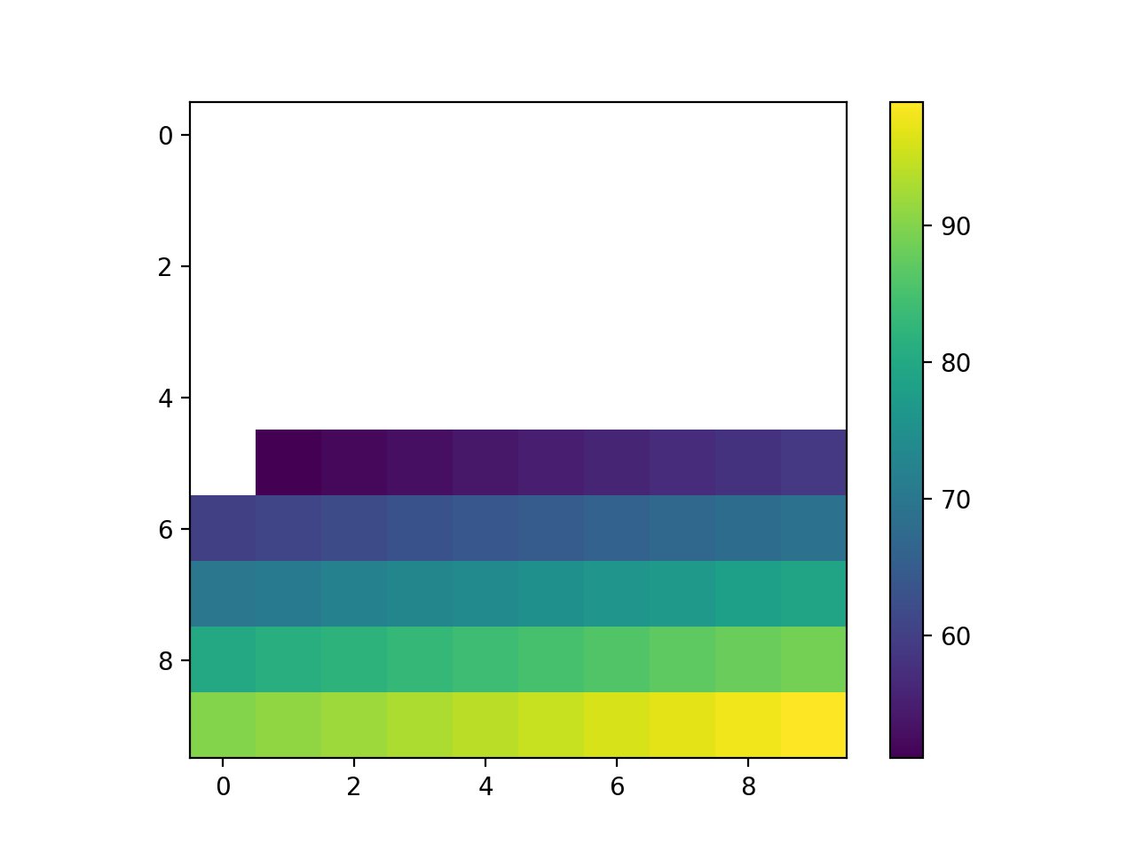
threshargument to set a threshold for plotted data. Any value less than or equal tothreshwill not be colored, and the colorbar will be updated to reflect this.>>> from serpentTools.plot import cartMeshPlot >>> from numpy import arange >>> data = arange(100).reshape(10, 10) >>> cartMeshPlot(data, thresh=50)
(Source code, png, hires.png, pdf)
